UPDATE MAY 2020: In April 2020, Conrad Steyn removed the version of the C.S. Tarot that I reviewed here and replaced it with a second edition in May. The new editions can be found at his Tarot Lounge shop on Make Playing Cards. At the end of this review, I also discuss how you may wish to create a box for this deck. In order to keep costs down for consumers, most of the options for the second edition of the C.S. Tarot do come without a box. Only the tarot size linen deck with an amber back comes with a box. However, Conrad endorses your ability to add a custom tin to your order and has provided downloadable art for the covers on his website. Conrad does not receive any additional money for you creating a tin for your deck.
UPDATE AUGUST 2020: In this review, I am very enthusiastic about the linen cardstock option for this deck. Unfortunately, the printer–Make Playing Cards–has changed the quality of their M31 Linen cardstock. It is now much thinner (about 7 cards thinner per deck than the previous cardstock), way more flexible, and has a more satin laminated finish. It also doesn’t shuffle nearly as nice as the previous card stock. I cannot recommend this cardstock any longer. In addition, Conrad no longer prints decks on the S33 Superior Smooth cardstock I mentioned here, due to the price increase for this cardstock. Current editions are avaliable in the S30 Standard Smooth cardstock, which is quite nice, the new M31 Linen which is not good, and a plastic card.
If you had told me last December that my biggest magical focus of 2019 would have been in studying tarot, I would have probably been hospitalized due to the hysterical laughter. I’ve been reading tarot cards for nearly a quarter of a century now. Tarot had long ceased to be a subject of fascination for me and had simply become another skill in my magical wheelhouse. In fact, I thought I’d spend 2019 moving deeper into my Gardnerian practices with an eye toward preparing for the third degree.
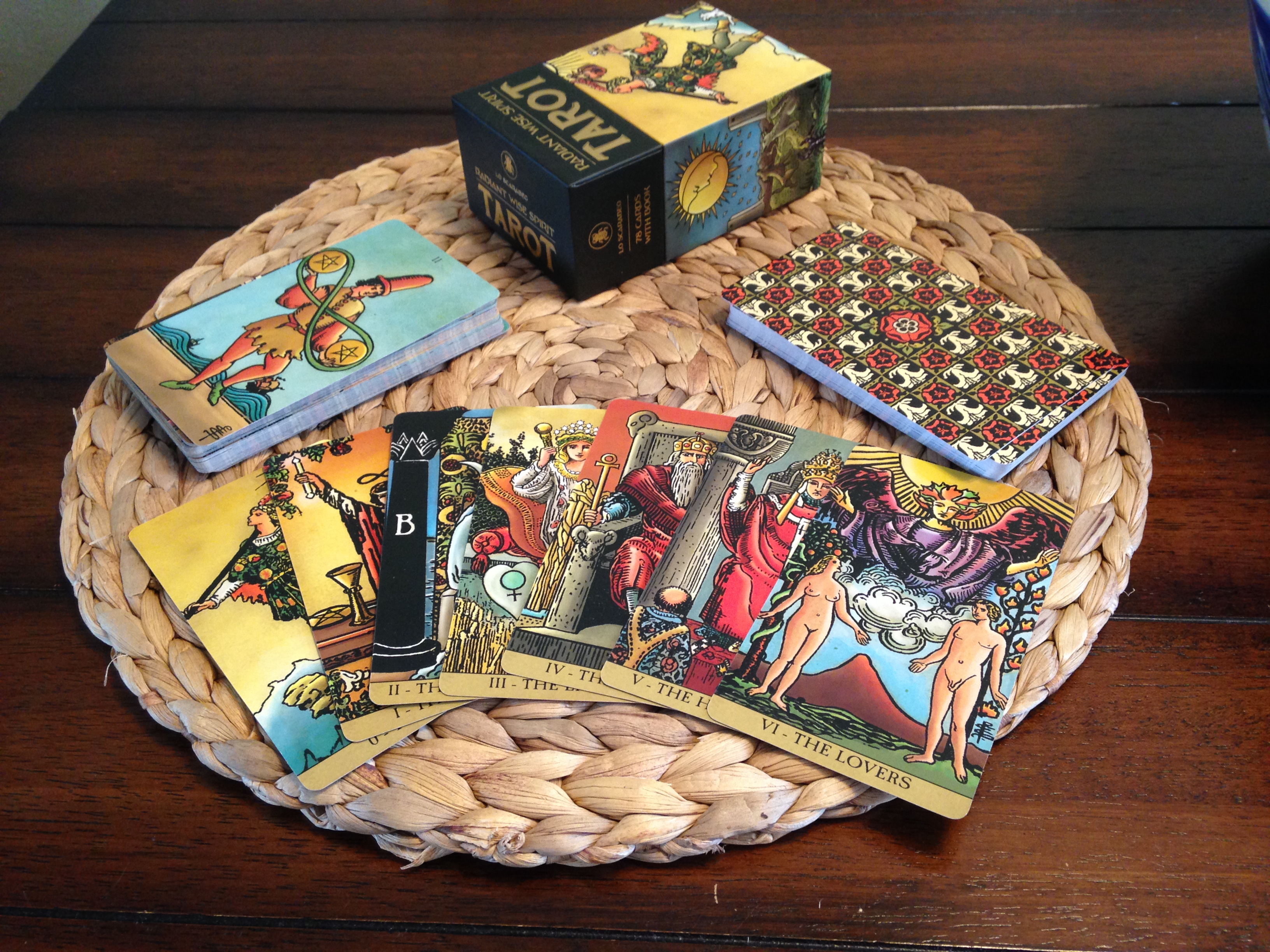
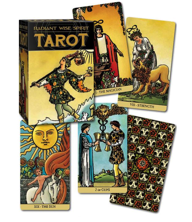
But 2019 was an odd duck, and tarot became my focus. Coincidentally, 2019 also saw a renewed global interest in one of my favorite decks, the classic Rider Waite Smith, as illustrated by Pamela Colman Smith under the direction of Arthur Edward Waite. Lo Scarabeo has published two RWS decks this year: the Radiant Wise Spirit and Tarot: Black and Gold Edition. English speakers started to find ways to get English-language copies of AGM-Urania’s Tarot of A.E. Waite (link is to German edition), from Polish, Lithuanian, and German sellers. (The deck was initially published in 2016, but the English version was quickly barred from sale in the U.S. and U.K. by U.S. Games.) Smaller companies like Siren Imports and M and A Limited jumped onto the scene with their own re-drawn and re-colored versions (spoiler: Siren’s two editions are remarkably good, M and A’s is trash). And with the rise in quality of several print-on-demand card manufacturers (notably Make Playing Cards, Game Crafter, and DriveThru Cards), several tarot enthusiasts and artists have attempted to make their own ideal RWS deck.
Conrad Steyn’s The C.S. Tarot falls into this latter category, and it stands as wonderful testament to the quality attainable within this route of deck production.
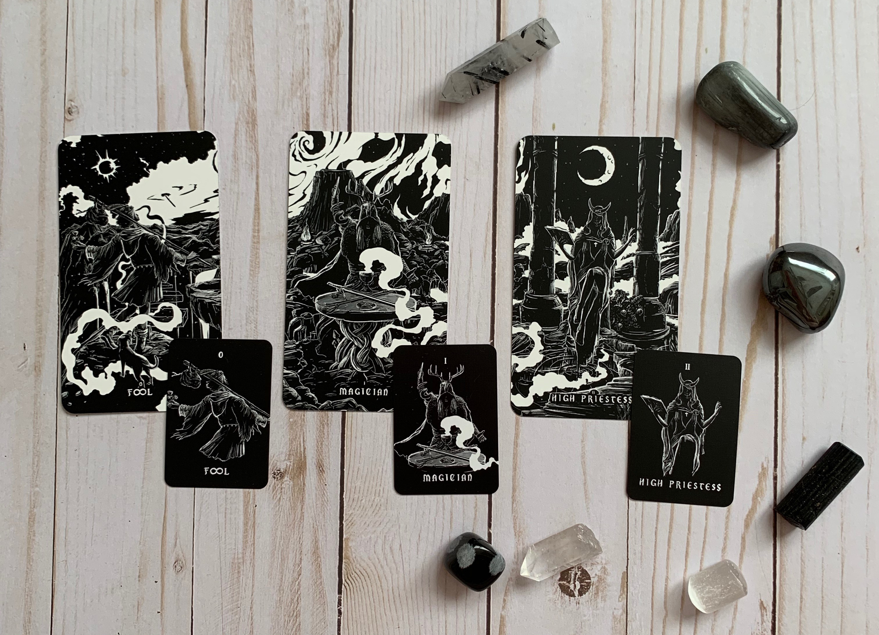
Conrad Steyn’s deck is so pretty!
Conrad Steyn is based out of Port Elizabeth, South Africa, where he has been a counselor for the past 10 years and is currently in the process of completing a doctoral degree in counseling psychology. He is also, obviously, a tarot enthusiast and professional reader. I believe he has said that he has over 250 decks, and several of them are the various copies of the Rider Waite Smith deck. He, like so many RWS aficionados, has become deeply fond of Pamela Colman Smith’s artwork, faux-Renaissance clothing styles and all.
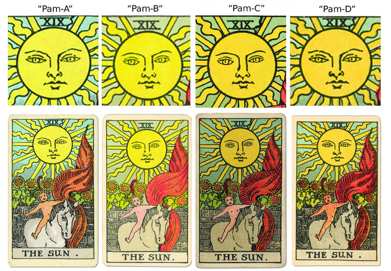
It is a sad fact that there just aren’t many RWS decks out in the market place these days that do Colman Smith’s artwork justice. My favorite are U.S. Games’s The Universal Waite and the Smith-Waite Centennial Deck, but even these have their draw backs. Mary Hanson Roberts did a phenomenal job recoloring Colman Smith’s drawings in The Universal Waite, and she did preserve a lot of Colman Smith’s work, but she entirely re-drew faces and had to eliminate Colman Smith’s line work, so it is impossible to actually regard that deck as Colman Smith’s artwork. Contemporary printings of The Universal Waite are also subpar. Production was moved to China, and the lamination on the new printings has a very waxy feel and will leave a residue on your hands, which I personally find distasteful. (Definitely find a vintage Belgium printing in the beige box if you want this deck.) The Centennial, on the other hand, is a remarkably faithful printing. It is a high resolution scan of the cleanest cards from Stuart Kaplan’s Pam A decks–which is about as faithful to Colman Smith as it gets. U.S. Games digitally cleaned the cards up as best they could, but then they overlaid all the cards with a vintage filter, presumably to better market it as a hundred-year-old, “original” copy (and pick up the side benefit of camouflaging any dirt or damage that was missed in editing). Unfortunately, the filter sucks the light and life out of the cards and makes it a little harder to see the details of the deck clearly, which is a shame. The cardstock is also not much to get excited over either. The deck is a bit on the thick side, which can throw off clients used to a 52-card poker deck, but at least its lamination avoids the waxy issues of The Universal Waite.
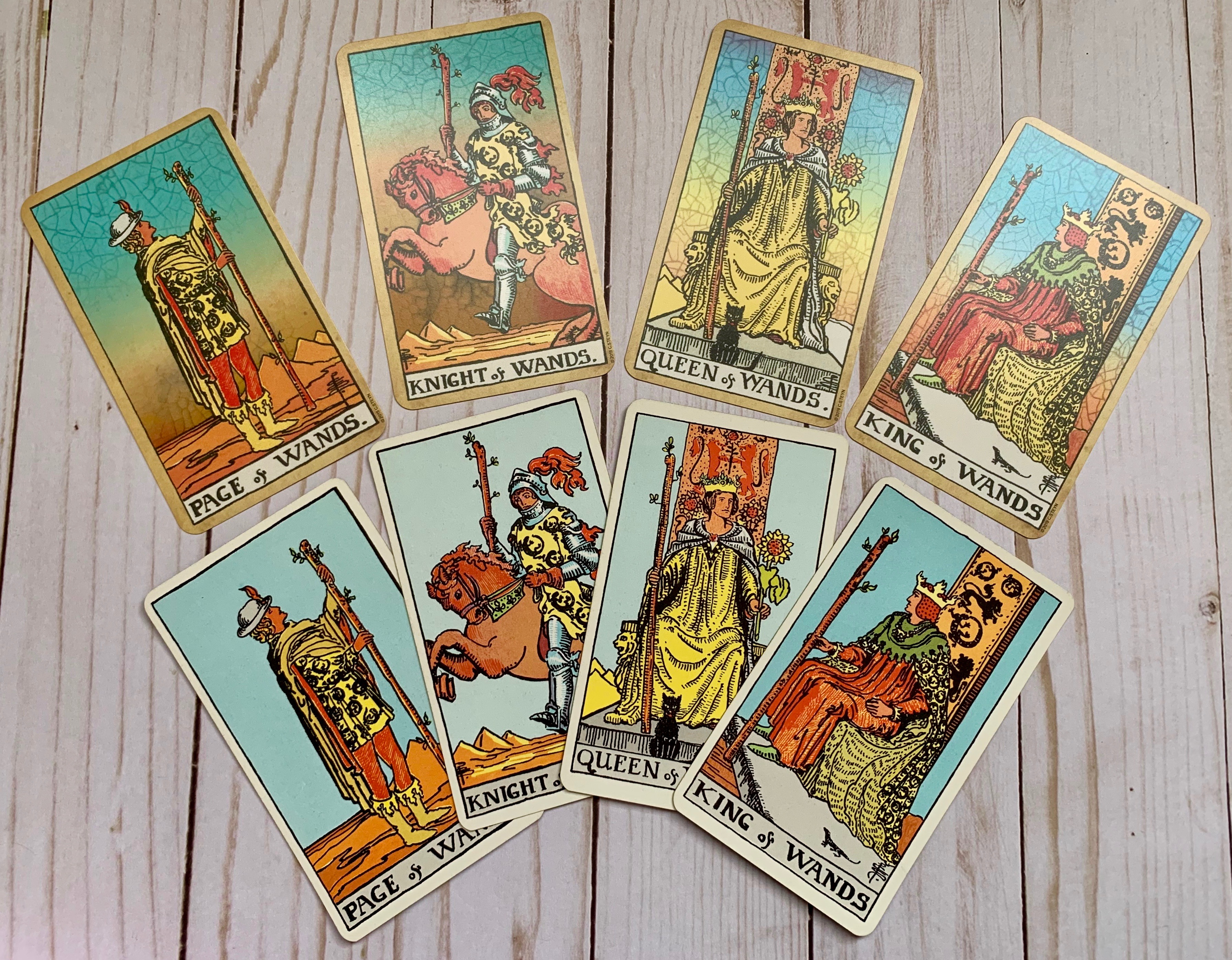
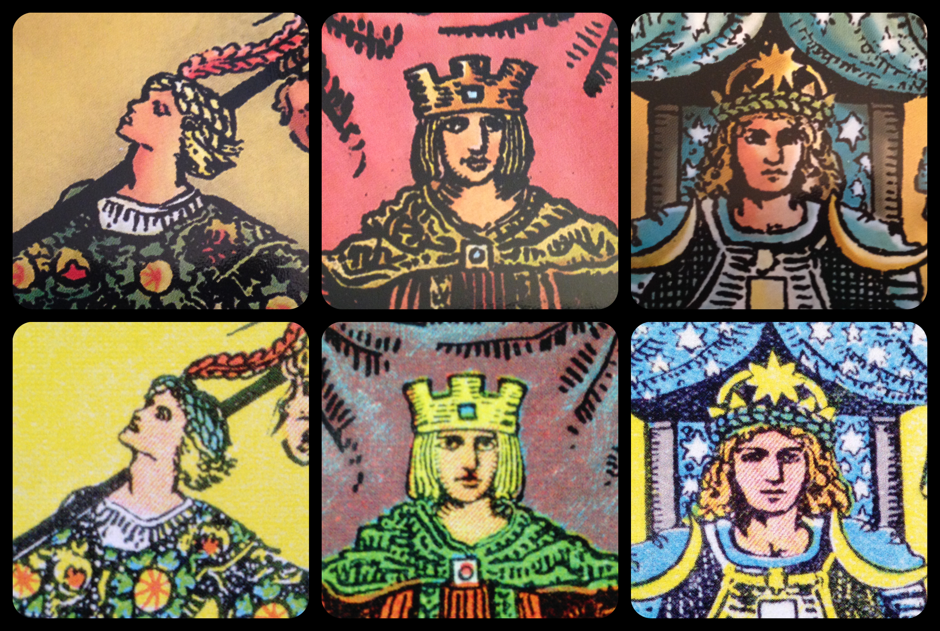
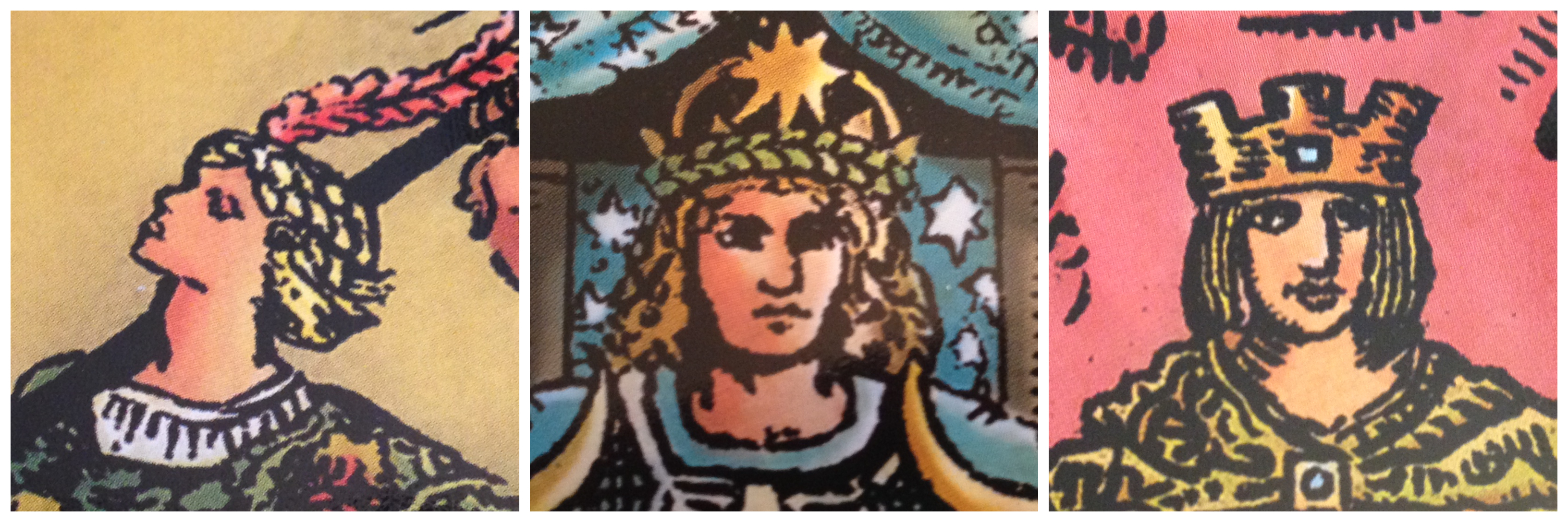
Top Row: The Court of Wands from the C. S. Tarot. Bottom Row: The Court of Wands from a 1970s printing of U.S. Games’s Rider Waite Tarot.
Out of a frustration of what was available in the market and as a way to pay homage to Colman Smith, Steyn decided to create his own deck. He wanted to feature Colman Smith’s artwork as unaltered as possible and to honor the fact that it is a deck that is over 100 years old, but he also wanted to marry it with twenty-first century aesthetic and seriously good card stock.
For the materials, Steyn drew inspiration from Uusi, a design company founded by artists Peter Dunham and Linnea Gits in 2010. While Uusi does have some three-dimensional products, they are very much a print company and seek to use the highest quality materials they can. In 2016, they released a tarot deck, Pagan Otherworlds, whose beauty and quality made a huge splash among taroists. In particular, many people fell in love with its black core cardstock. It shuffled beautifully and felt sturdy in the hand thanks to its 340 gsm weight, yet retained pliability thanks to its embossed linen finish. This brought Steyn to Make Playing Cards, which (then) offered a superb 310 gsm black core linen card stock. As a bonus, Make Playing Cards is also open to deck creators and purchasers across the globe, not just Europe and the United States. (This is especially key for Steyn, since as a South African, he is unable to use other popular independent outlets like Kickstarter and Indiegogo to promote and market his deck.)
For the artwork, Steyn turned to an early pre-copyright early 1970s printing of the Rider Waite tarot. At that time, AGM in Switzerland was printing the same decks and separately packaging them for the blue box Rider & Co. (U.K.), and the yellow box decks for both Samuel Weiser (U.K. and U.S.) and U.S. Games (U.S.). These are remarkably lovely decks (despite the hideous plaid backs) because they maintain the sharp line work of traditional printing methods, but use more modern color printing than was available from 1910-1940. Its color can be laid down quite evenly without using layers of lithographic lines (as in Pam A) or blotchy dots (as in Pam B). And unlike subsequent printings of the modern deck, these early 1970s printings are very close to the colors and hues used in the Pam A decks (albeit a touch brighter and with less nuanced shading).
(Note: Steyn found his pre-copyright deck secondhand in a local shop, and it did not come with its original packaging, so he does not know whether it is Rider & Co., U.S. Games, or Samuel Weiser. Given that he is South African, my best guess would be a 1973 Rider blue box, for Rider tended to distribute more over the former British empire while the other companies largely focused on America and Canada. It doesn’t really matter, though, as they’re all the same AGM cards.)
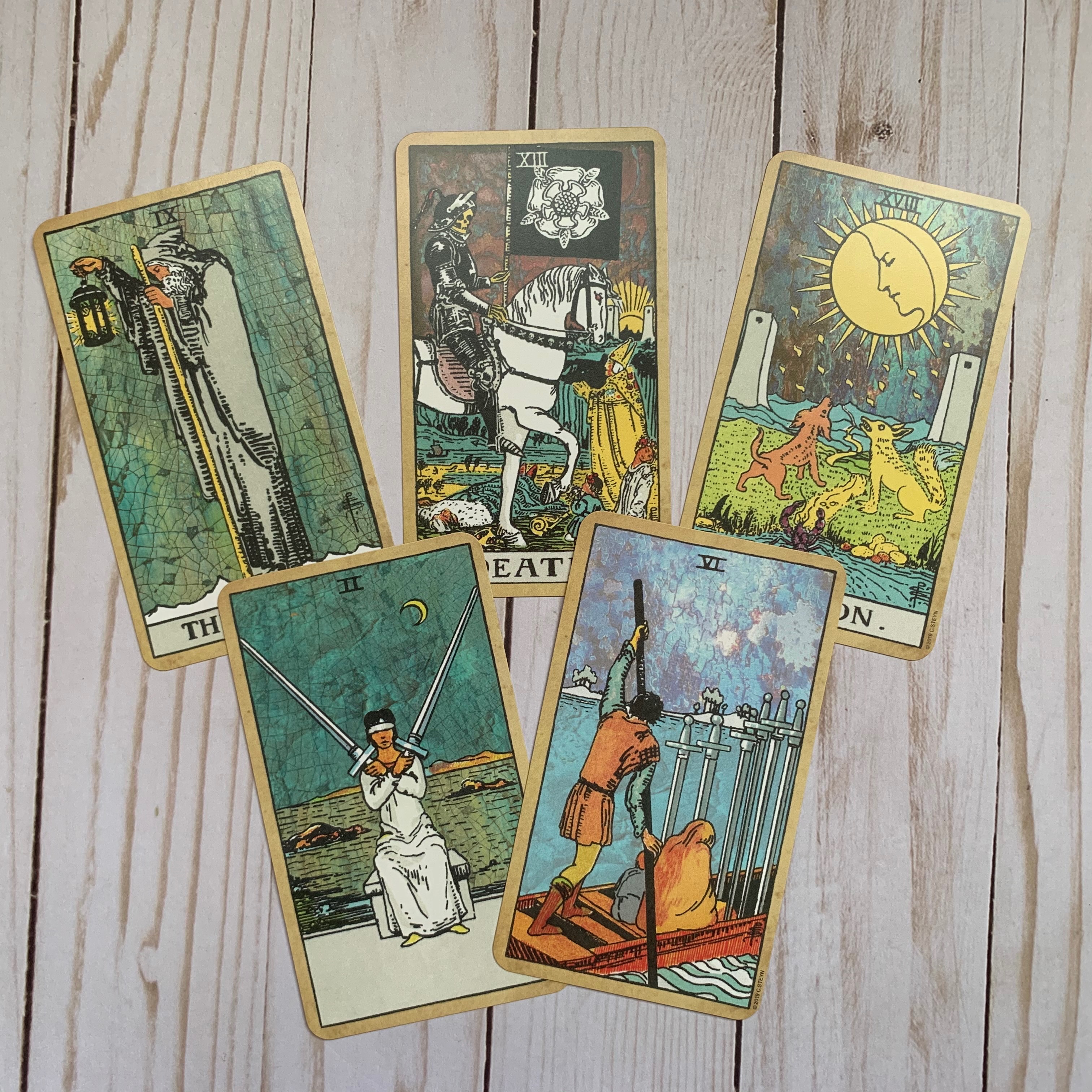
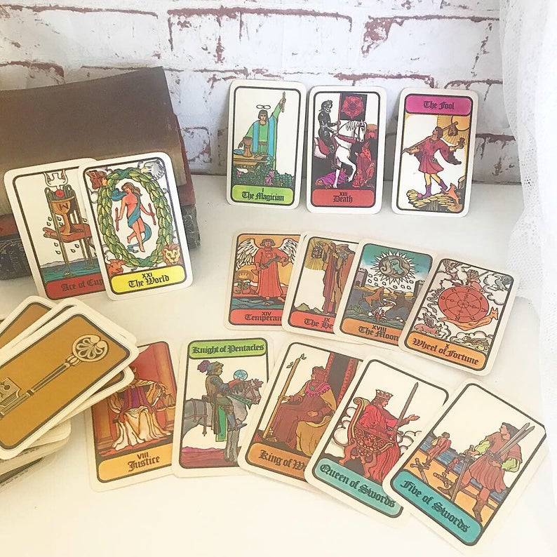
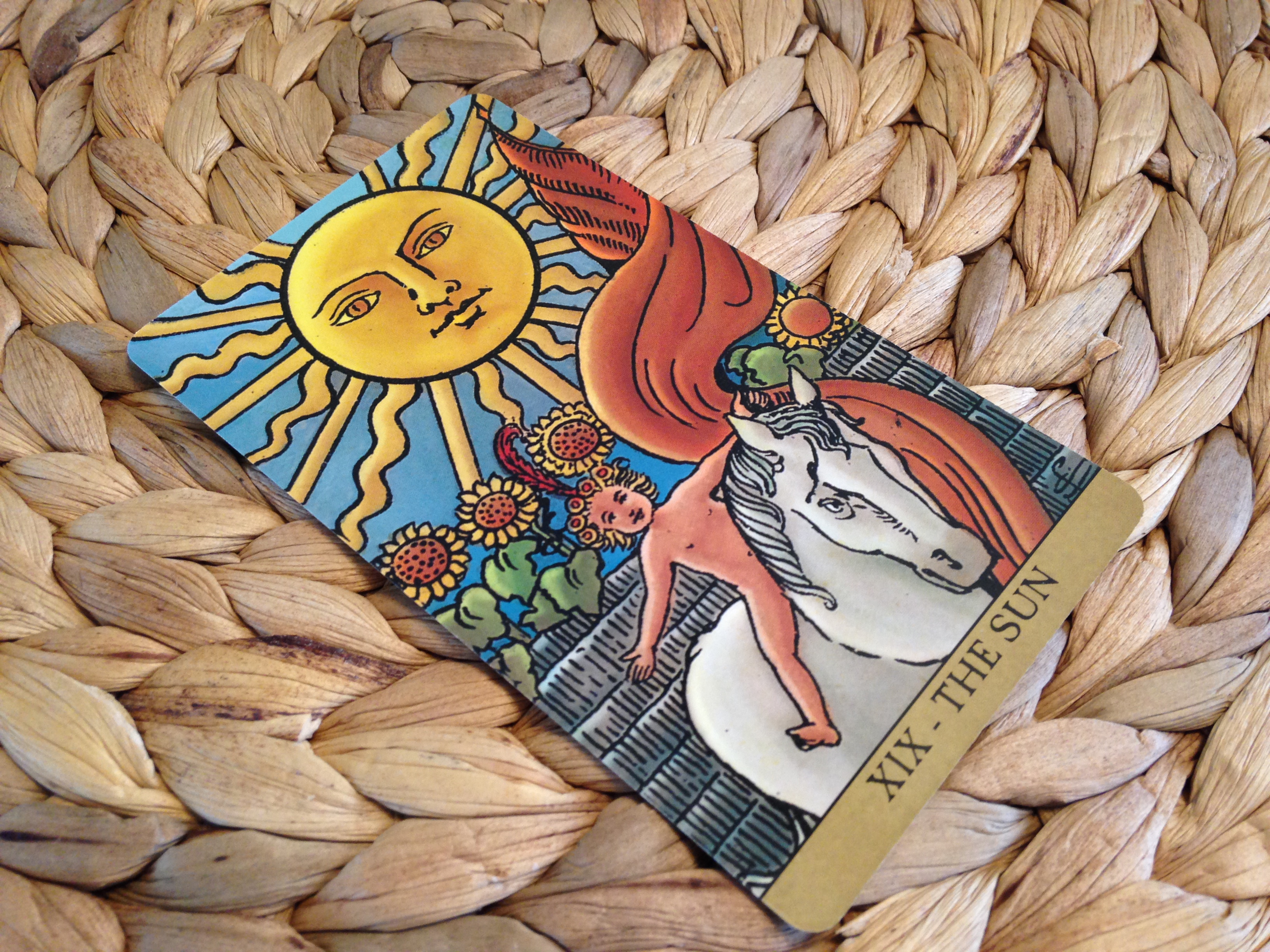
These are some of my favorite cards from the C.S. Tarot Deck. I absolutely love how the Hermit Card looks almost like a piece of labradorite. And the 2 of Swords actually looks like it’s at night in this card. I really enjoyed how Conrad extended his crackle effect into the water on the 2 and 6 of Swords, too.
Once the materials were sorted, Steyn opted to bring more modern aesthetics into the RWS deck not through modifying the artwork, but through changing backgrounds. In fact, the only changes he made to the original artwork were to balance color saturation and contrast to either stand better against the backgrounds or to optimize them for printing.
And the backgrounds! Steyn has no formal training in computer graphics or design, and yet he was able to develop backgrounds that give each card a moody atmosphere that strongly reminds me of the coveted Lo Scarabeo “Dirty Pam” (which eventually became the Radiant Wise Spirit), but maintains the clarity of good Pam A linework and avoids the use of distracting filters. In fact, every single one of the background effects is unique. Not a single thing (except the border) has been unilaterally applied to all the cards. Steyn definitely deserves an A for effort.
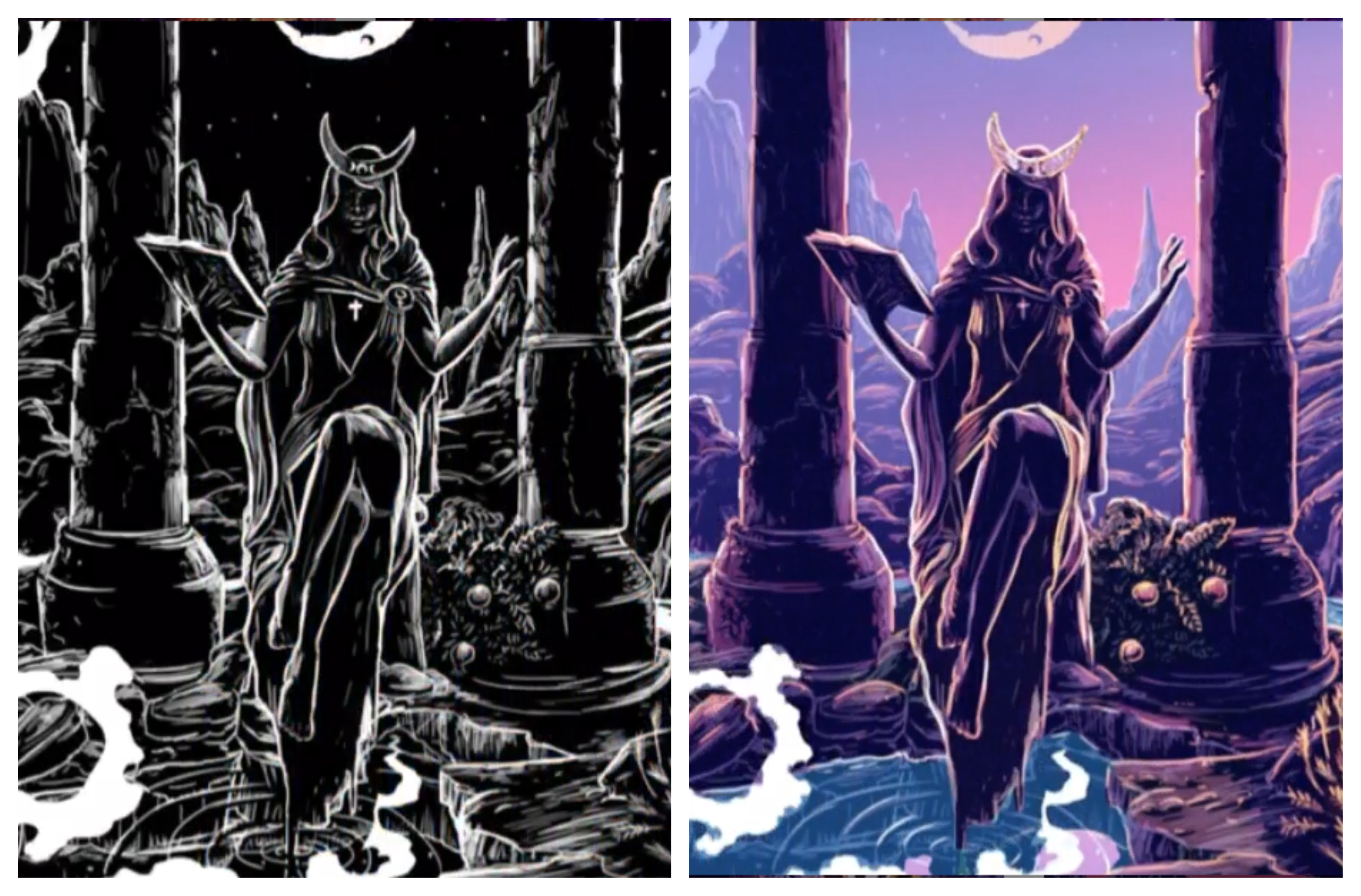
In my book, he also gets an A for execution. The background of all these cards has a sort of “crackle” effect, which initially reminded me of the crazing that oil painting and pottery acquire through the years. But the story behind this aesthetic choice lies in the backing Steyn designed for these cards. Steyn took a piece of amber that he had, and took a macro photograph of it, capturing its inclusions. He then manipulated the image to enhance the cracks and turned it into a mosaic with both horizontal and vertical symmetry. (In fact, the backs would be fully reversible if he had not included Pamela Colman Smith’s signatory sigil…but that’s a small matter. I find that my hands largely block the card center as I pull cards, so I’ve not had a problem “avoiding reversals.”)
The cracked amber backing sets up a metaphor that carries Steyn’s attitude toward the tarot and to his design process for this deck. Amber, as we all know, is not a rock that stretches to the earliest glimmers of terrestrial history. It is, instead, petrified tree sap, and frequently contains within it plant and animal matter from time long forgotten. To retrieve the genetic knowledge hidden within amber, we have to crack the stone in order to access it. The tarot, too, allows us to access forgotten, subconscious knowledge, if only we have the courage to crack through its symbols and search for it.
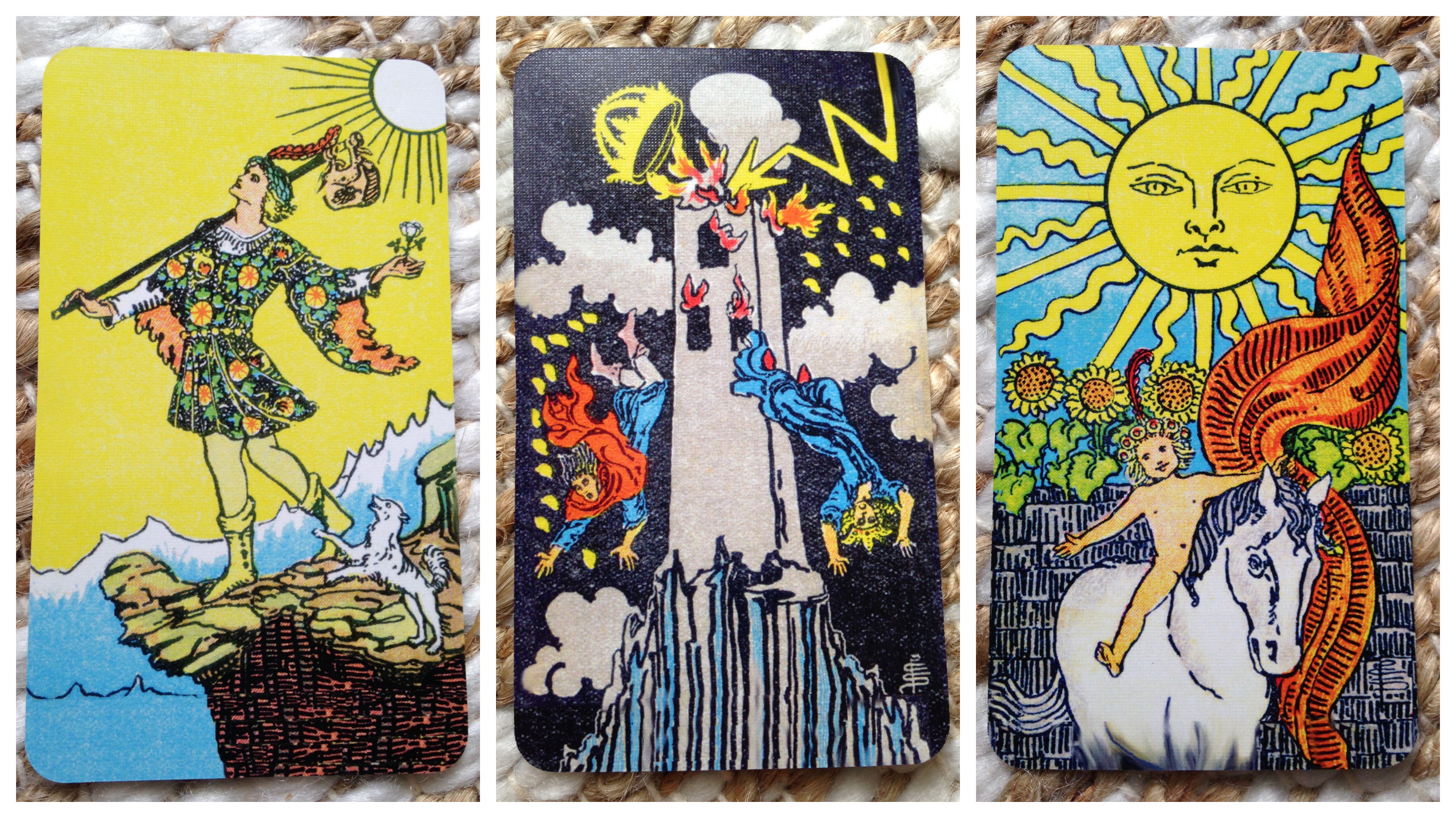
Not all of the backgrounds are wildly different or have extreme coloration, which is one of the things that I think helps keep this deck closer to honoring Colman Smith than other modern recolorations. In fact, the first time I saw a walk through of the deck, I thought that the “dark” cards–the Devil, the Tower, and the 9 and 10 of swords–were unmodified. A closer look, however, shows that Steyn moved his crackle effect to the Devil’s wings and the Tower’s clouds, which I think was a nicely solid move to keep the deck unified while also maintaining the pitch black these cards require. The 9 and 10 of swords, as minor arcana, can take a little lightening. In these, the black backgrounds are subtly crackled.
The crackling can sometimes be tight and a little busy–such as on the World card (you can see a corner below)–so I was worried about how it would impact the more visually cluttered of Colman Smith’s cards: the 5, 10, and King of pentacles. I actually had to search for the crackle in the 5, that’s how subtle the darkening of the snow was, so the effect poses no issues there. I also think the effect improves the composition of the 10. In that card, I’ve always found that my eye immediately latches onto the tower in the one “open” space on the card. It takes me physical effort to look down into the scene and that crazy robe the old man is wearing. But with the crackle in the sky, my eye now goes directly to the old man’s head, travels to the dogs, and then can take in the whole scene. With the King…well, I can actually stand to look at the card now that the sky is a subtle butter yellow rather than a high contrast canary against the black. That combo has always read as “danger” to me, which counters this King’s otherwise chill vibes.
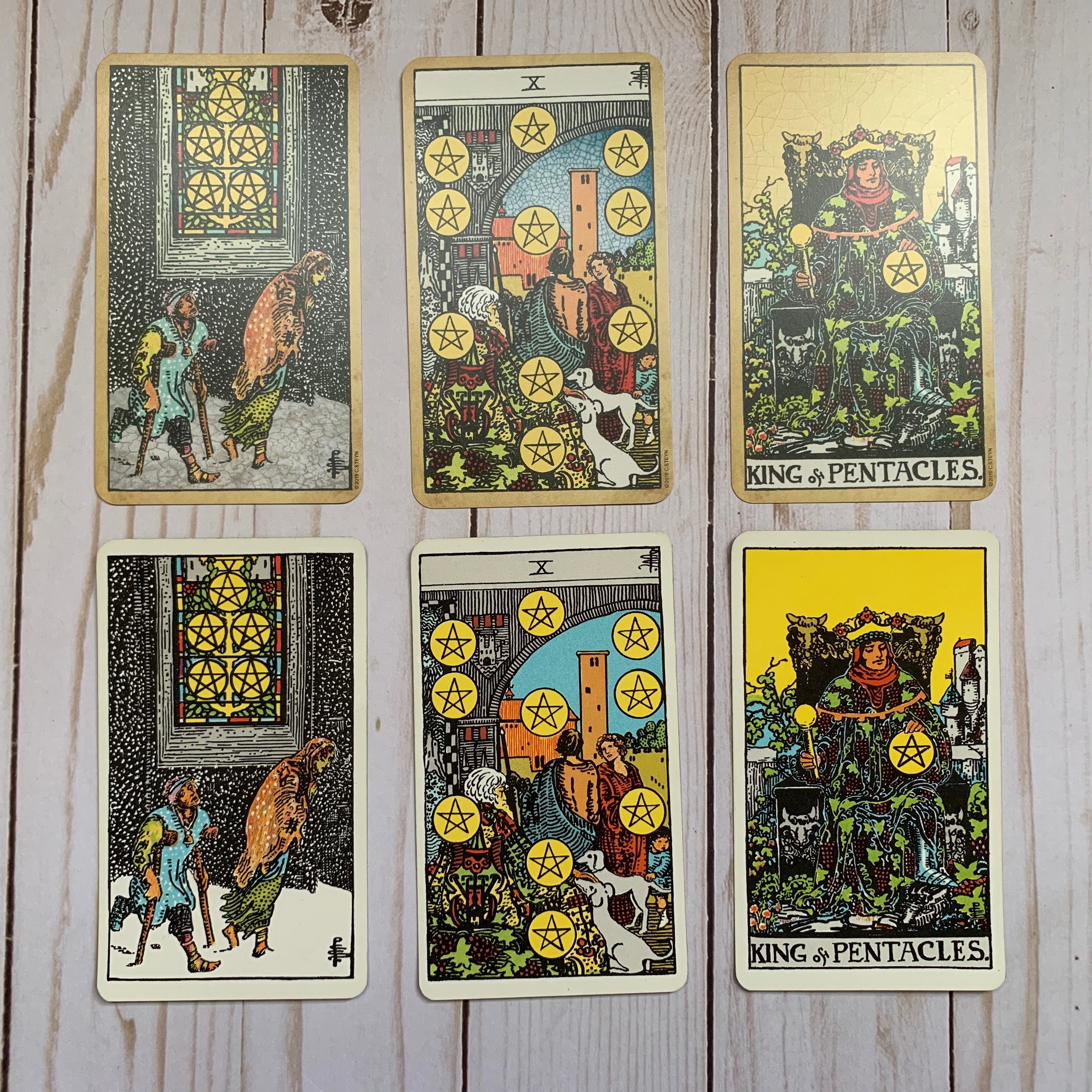
Top row: C.S. Tarot. Bottom Row: 1970s US Games Rider Waite Tarot. Conrad’s King of Pentacles isn’t as washed out in real life. I was getting some weird light glare from the window.
While Steyn was inspired by Uusi’s cardstock for Pagan Otherworlds and wanted to provide a linen finish, he was also savvy enough to understand that not every taroist likes a linen cardstock. Linen stock allows little pockets of air to remain between the cards, which gives them a greater slip against each other. All those fancy card tricks that magicians can do? All those dramatic fannings that Vegas card dealers whip out? Those are made possible because of linen card stock. It handles and shuffles beautifully. On the downside, it can make the cards harder to hold on to, particularly if you have smaller hands or less dexterity.
A huge benefit of setting up his distribution as a print-on-demand service meant that Steyn wasn’t married to a single card stock. In the end, he enabled two options that could be ordered through his Tarot Lounge shop on Make Playing Cards: Option 1 is the deck on smooth stock, Option 2 is the deck on linen stock. Both the smooth stock (which MPC calls S33 Superior Smooth) and the linen stock (which MPC calls M31 Linen) have a weight of 310 GSM, and both are made with a black core between the white paper layers. Having this core means that it is impossible for printing on one side to show through to the other. Indeed, it’s impossible for visible light to penetrate through that core. A similar option would be a blue core. Both are used in casino decks to help minimize cheating, but black core is preferred because it is more opaque and they gives the final card a whiter appearance. This allows any colors printed on black core cardstock to read as more true to tone. Blue core gives the white a more blue or slate grey tone, and that can skew ink colors and make artwork appear darker. It is also slightly more transparent, which can impact how “crisp” the art will look to the eye, since some light will diffract through the colored inks into the paper. You’d actually want that transparency for photographic printing, as it will make the photograph look more realistic. But for drawn art, black core is definitely the way to go.
When Steyn first set things up with MPC, he heavily endorsed choosing the M31 cardstock, which he vastly preferred on his prototype decks. It was remarkably similar to that of Pagan Otherworlds in that the linen finishing was buttery smooth in texture and felt rigid while still retaining enough pliability to withstand the bending of riffle shuffling. Just prior to launching the decks for public access, however, MPC was forced to find a new paper mill for its M31 stock as the previous German supplier had gone out of business. The M31 that MPC now provides is, on paper (hah!), similar to that of the previous supplier. In person, however, the texture is a little rougher and the paper is more flexible.
Interestingly, increased flexibility of a cardstock makes that cardstock feel thinner in your hand than it actually is. It’s a really cool feedback loop in your brain. You’ve got years of experience telling you that thicker things are more rigid than thinner things, so you begin to equate the two and you can’t readily overcome that association. It’s a bit like an optical illusion…just tactile.
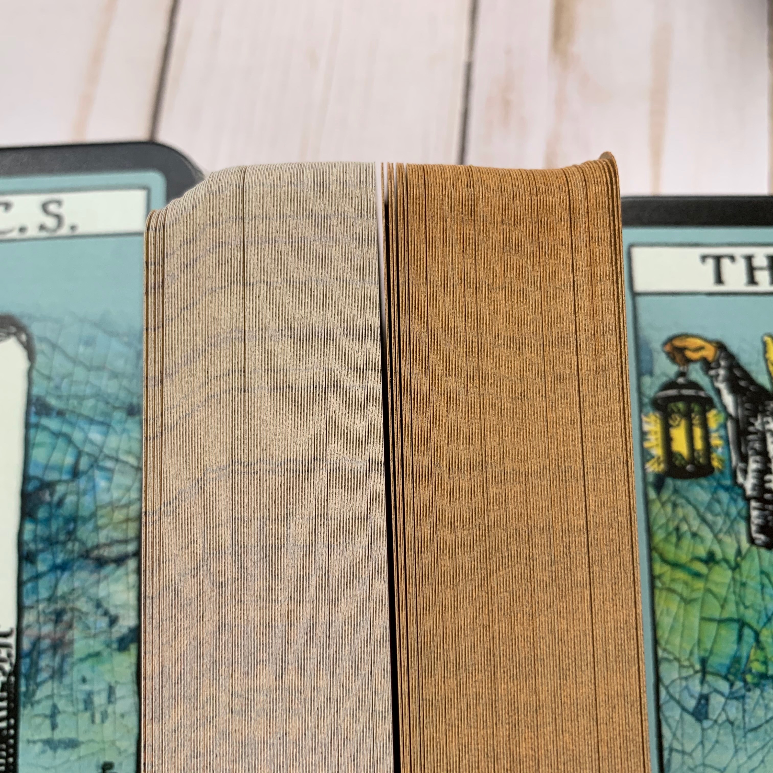
I did get a copy of both finishes, as you can see below, and I can attest that they both have similar level of lamination on their finish and that the two deck are the exact same thickness. I was a bit surprised when I first got the linen deck that it felt so much thinner to me than other decks. But it is only 6 cards shorter than Pagan Otherworlds, which uses 340 gsm stock. It is about 12 cards shorter than my new copy of the Centennial (when I remove the extra cards), but it is the exact same thickness as my vintage Universal Waite (again, when I remove the extra cards).
That Universal has been a standard deck of mine for about 20 years, so when I measured the decks, I was surprised that I was perceiving the M31 as so flimsy. So I gave it a good solid try before I dismissed the cardstock and judged it to be cheap. And boy, was I surprised. I loved the linen cardstock once I started working with this deck. It is remarkably slick, even for a linen deck. The cards glide over each other better than my Pagan Otherworlds deck, even though the M31 stock is a hair rougher in texture. (And really, I had to give those two decks a solid feel and do blind comparisons to feel any difference.) They riffle shuffle like a damn dream, too. It feels like a casino deck.
The casino feel might not be every reader’s personal preference…but it goes a long way when reading for others. I’ve got a few regular clients who are more card savvy than your typical person paying for a reading, but the grand majority of the people I read for don’t have much experience handling cards that aren’t a standard poker deck. When they go to shuffle the massive cards of my Next World Tarot for example, or my thicc Bonefire deck, they drop the cards all over the place. With the linen C.S. Tarot, they get good shuffles without even trying. It’s very impressive, and one of the things that makes me appreciate this deck as a professional one. As a side bonus, it’s also easier to photograph the linen deck as the finish minimizes light glaring off the lamination.
That being said, the S33 Superior Smooth cardstock is also lovely and easy to handle. In fact, it feels exactly like the lovely cardstock used in my vintage Universal Waite, which is a bit spooky. The S33 is now the cardstock that Conrad Steyn is personally endorsing…but I’ve got to say, I really enjoy the M31 Linen, even if it is different from his original vision.
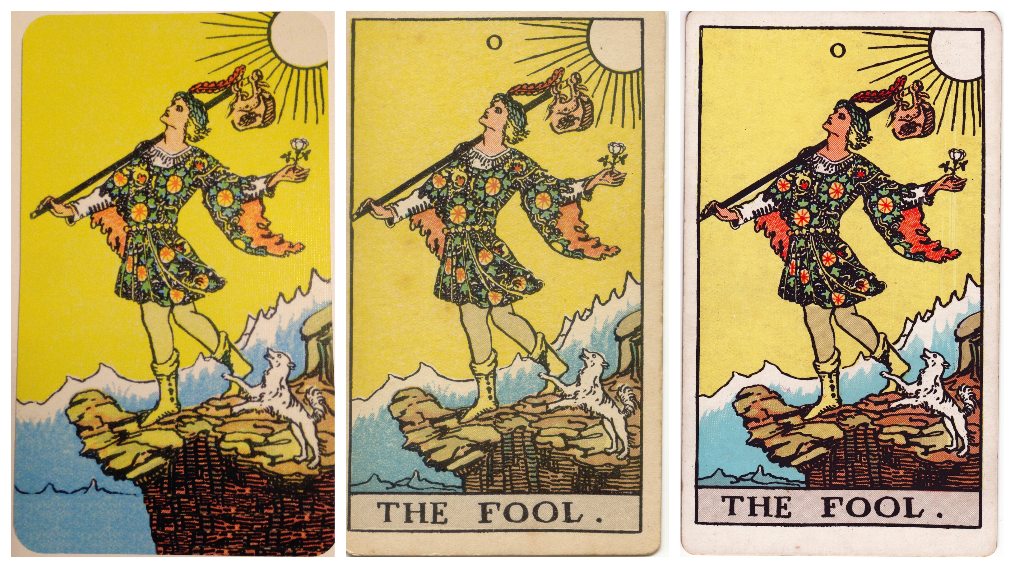
I edged my linen finish deck and have let the smooth finish plain for now. It’s my “back up deck,” so there’s no rush.
If you decide to get a copy of The C.S. Tarot Deck, you may also want to set aside some money in your budget for some craft supplies. The C.S. Tarot isn’t a borderless deck, but it does have a colored border. In fact, Steyn took a scan of a page from a 100-year-old bible dictionary to get a color and texture that would remind one of naturally aged paper without resorting to a filter. I love the colored borders. When I compare Steyn’s deck with a basic RWS, I find that Steyn’s frame of aged beige helps to “pop” the artwork almost as much as going borderless does. The downside of the colored borders is that the white card edges stand out a lot when you’re handling the deck, so you may wish to color the card edges.
For this deck, I don’t think I’d recommend edging it in a dark color. From what I’ve experienced, MPC’s cardstock is a bit “thirsty” and inks tend to wick between the plastic lamination into the paper. I liked the beige borders enough that I decided to match them when it came to edging. I ended up using a Master’s Touch Fine Art Studio alcohol marker in color 142 Pale Cream. It’s very nearly a perfect match. If I look very closely and with some magnification, I can see a microborder from the ink bleed (it is slightly more golden than the actual border)…but that is with extreme inspection. It’s virtually invisible otherwise. (Can you tell in the picture of the Fool and World cards above? The linen card is edged and the smooth card is not.) A couple people who received Steyn’s prototype deck have edged theirs in with a Winsor Newton Promarker in Caramel, however the prototype deck borders are a darker than the current decks. If I had to get a Winsor Newton pen, I’d try the Vanilla or the Pastel Yellow instead (Vanilla seems to be the closer match to the Master’s Touch Pale Cream, at least based on what my computer monitor tells me.)
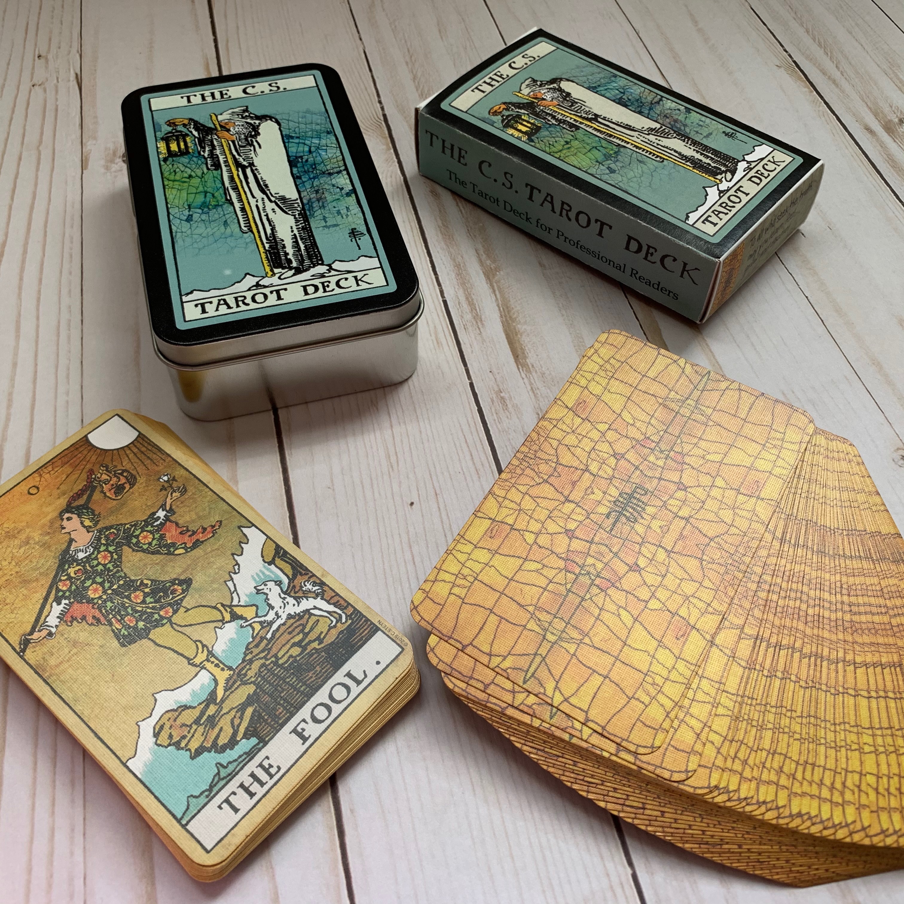
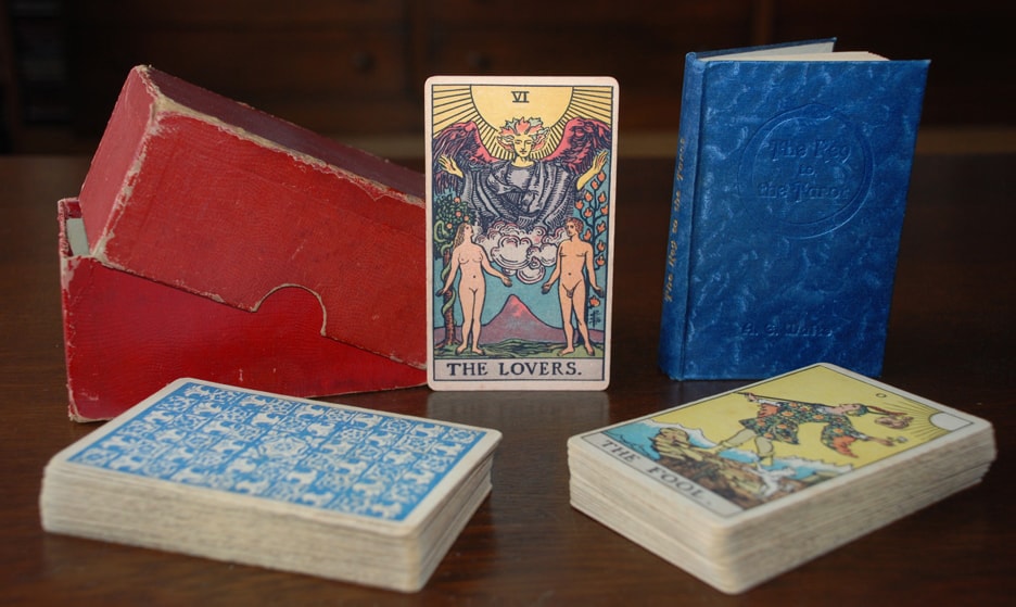
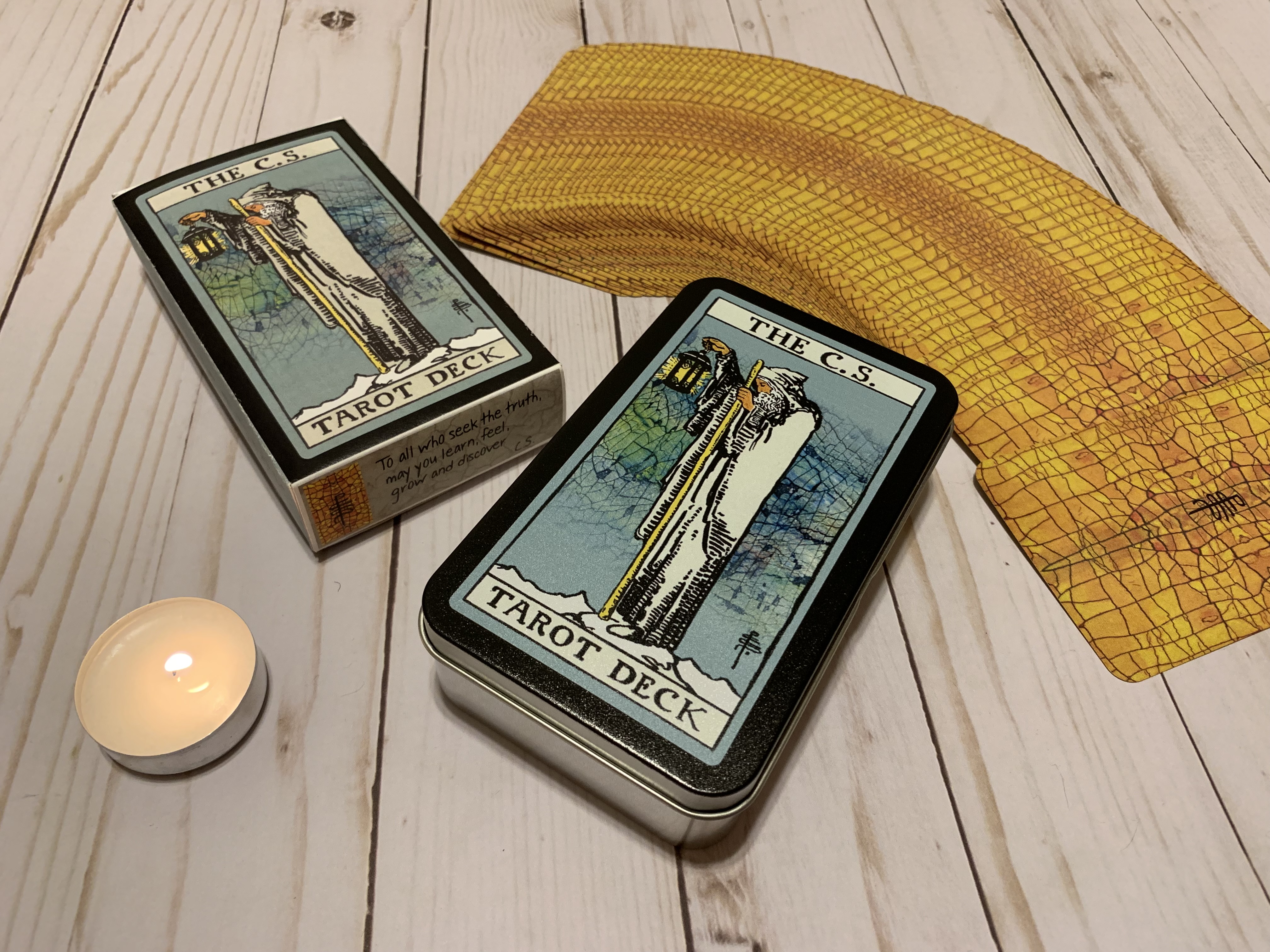
You can make your own tuckbox (right box) with the file below for the cost of printing onto the sturdiest card stock your print shop can manage, or you can upload the cover file onto a tin (left box) and add it to your Make Playing Cards order for an extra $14.
You’re also going to want to budget supplies for a box because this deck does not currently come with a box. I totally understand why Steyn didn’t create an option to have decks with boxes at this point. With MPC, it does does add a lot of cost to the deck. Cards that might cost $30 without the deck suddenly jump to the $50-$80 range, and those prices give lots of people pause. And if you’re a professional reader buying replacement decks, you probably have little interest in boxes or paying for their additional cost. But non-professional readers really value having packaging in which to store their decks. It probably wouldn’t be the worst thing for Steyn to add boxed options to the store at some point alongside the current unboxed ones. Given that he already provided different options for cardstock, I think it likely that professionally boxed versions of his deck may someday be a reality.
Until then, Steyn has provided a way for customers who desire a box to make one. He has created a .pdf that will allow you to print a pattern for a basic tuck box, and tuck boxes are remarkably easy to make. You just cut out one flat shape, score where you’d make folds, and glue two edges. If you can wield a sharp X-Acto blade or scissors, you can make a tuck box. You can request that file through Steyn’s contact form on his website, and he has also given me permission to post it here:
C.S. Tarot Tuckbox A4 or Letter
Steyn’s .pdf is optimized for A4 paper, which is the standard for pretty much everywhere but the U.S. I’m American, and I can attest that it prints out just fine on our letter size. I have found, though, that most print shops here can’t print on a cardstock thick enough to make a solid box. If you print directly onto a basic printer’s cardstock, the box will feel a bit thin. I printed Steyn’s file onto a piece of paper and then glued that paper to thicker kraft cardstock, which gave me a nice box. However, I think I needed to use a different glue (I just used an acid-free gluestick) as the paper peeled away from the cardstock after a few weeks.
By this point, you may be confused as to why you see tin boxes in my photos if boxes aren’t available. That’s because I ended up poking around the MPC website and learned that I could have them custom print tin lids for tarot boxes. So when I next ordered through them, I had a tin for my C.S. Tarot printed. To make the cover image, I basically just cropped out the face cover from Steyn’s file of the tuckbox and played around with extending the black border until I’d created a JPEG that would properly center on the lid without additional editing. Making the tin only added $14.30 to the price of the deck, and I think it turned out remarkably well. The tin does push the total deck cost to about $56 once shipping is factored in, but you pay shipping regardless and I probably would have spent around $15 anyway to make or buy a storage bag for the deck.
The C.S. Tarot is truly a lovely deck, no matter which option you choose or how you choose to customize it, and I’m really glad to have discovered it. It’s well worth adding to a collection if you’re an RWS aficionado, if you’re a professional reader looking for a quality, client-friendly deck, or even if you’re brand new to tarot and looking for a useful but attractive RWS to study as a primary deck.