
My copy of the Radiant Wise Spirit Tarot in all it’s photographic glory. Pity my camera skills aren’t better because these are showstoppers.
One of my favorite RWS decks of all time is the Universal Waite Tarot (a vintage Belgium printing, of course!). I fell in love with it as a teenager for its clean linework and dynamic colors, and it remains a “go to” deck in my collection. Even though the Robin Wood is my ride-or-die deck, I reached for the Universal Waite first for years when I gave readings for others. (Well, at least others who weren’t in my coven.)
I still maintain that that the Universal Waite is the best version of the Rider Waite Smith deck on the mass market today. To me, Mary Hanson-Roberts’ recoloring is the sharpest and most detailed there is while maintaining Pamela Colman Smith’s original linework. You can spend hours looking at all the detail in these cards. But I got into the practice of letting my clients take pictures of their readings. One thing led to another, and the next thing you know I’ve got photo after photo of various card readings populating my Instagram. I started to notice that the Universal Waite tends to look washed out when photographed. At first, I attributed that to questionable photography and an abundance of filters. But then I started noticing that one deck’s cards photographed very, very well no matter what.

These are from the Radiant Wise Spirit, but the coloration is the same as the deck I discuss below, the “dirty Pam” or Lo Scarabeo’s first edition of the Pamela Colman Smith RWS Tarot. This photo looks damn good, and I took it with my exceedingly temperamental iPhone 5C in pretty low light conditions. I don’t think this deck can take a bad picture.
After following a few hashtags, I eventually determined that these cards all came from Lo Scarabeo’s 2016 Pamela Colman Smith RWS Tarot deck. From what I could tell in photographs, the coloring was really something to take notice of. The RWS deck is generally a very yellow deck, but this particular rendering leaned heavily on the blues and had been computer shaded to give a decidedly “moody” effect. In fact, I called this deck the “moody blues” deck for ages. I did eventually come across one of these decks in a shop and seriously contemplated buying it, but passed at that time rationalizing that I already had a perfectly useful RWS that I was more than happy with for all other purposes. “I can always get this one later,” I rationalized.
I rationalized wrong.
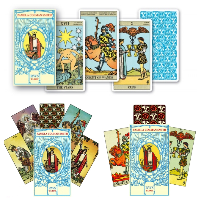
Lo Scarabeo makes things ridiculously complicated. Here are the three versions of their Pamela Colman Smith RWS Tarot. At the top, we have the first edition of this deck. It’s the Pam A version with the Lo Scarabeo multilingual labels on all the cards and the blue backs. I call it the “Italian Pam” because it is still being sold in Italian markets in new packaging as the “Tarocchi Pamela Colman Smith.” This first edition was sold up through late 2016 when the second edition, the desirable “Dirty Pam,” replaced it. Bottom left is the second edition, the “Dirty Pam” based off of Pam B that I fell in love with. Bottom right is the third edition, or the “Clean Pam” version of Pam B that began being sold from spring 2018 to the present.
Unfortunately for me, Lo Scarabeo still publishes a Pamela Colman Smith RWS Tarot deck…but the cards it contains are not the moody, atmospherically colored ones. They are not the ones that called to me throughout Instagram and Pinterest.
I don’t know the official story behind the change, but what I’ve pieced together is that when Lo Scarabeo first began publishing the PCS RWS with the blue backs, most people were quite pleased with the production as it was a nice, clean printing of the Pam A deck. Unfortunately, US Games believes they hold the current copyright to the Pam A deck, at least in Anglophone countries. (Technically they don’t…but that’s a story for another day.) There was probably some legal action threatened, so Lo Scarabeo pulled a quick switch and packaged a Pam B deck they had in the works in this box.
That Pam B deck was this pretty atmospherically colored deck. Now, many people do genuinely love this coloring…but Lo Scarabeo handled the quick switch badly. There was no announcement of the change or obviously noticeable alteration to the packaging, so people were ordering what they thought was a traditional Pam A with blue backs and getting this weirdly colored Pam B with red, white, and green backs. There were a lot of angrily worded letters. Then Lo Scarabeo got a lot of negative feedback when this second version hit the American and UK markets, because it was being promoted as an homage to Pamela Colman Smith’s original artwork…and it really wasn’t what with the digitized coloring and the replacement of Smith’s calligraphy at the bottom of the majors, aces, and courts with typeface.
Therefore, when the “atmospheric” stock ran out, Lo Scarabeo replaced it with a Pam B that had more standard coloration and restored Colman Smith’s calligraphy. They also changed the back up a little, blowing up the first run’s 12 rows of lilies and roses with a larger 8 rows.
Unfortunately, Lo Scarabeo hadn’t quite learned its lesson from the first change and maintained the similar packaging. By that time, loads of people were buying the PCS RWS specifically for its moody coloring and were quite upset by receiving the third deck. It took a few months for word to spread throughout the tarot community that these new cards weren’t a subpar counterfeit.
In the end, I could not find a copy of the atmospheric PCS RWS (version 2) that I had fallen in love with, and I have to admit I was a little crushed. But then I heard that Lo Scarabeo was bringing that art back this year in a new, borderless deck, the Radiant Wise Spirit Tarot.
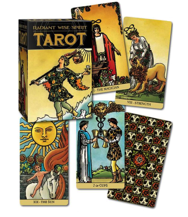
The official marketing photo for the Radiant Wise Spirit Tarot. Note that it is indeed borderless and that we have yet another iteration of the lilies and roses back. This one has 10 rows instead of the original 12 or the new 8. It’s also colored rather than all blue. Because it’s borderless and a re-branding of the Dirty Pam, people have taken to calling it the “Naked Pam.”
I’m not going to lie…I had a pretty severe fear of missing out on this deck, stupid name and all. (Seriously, Radiant Wise Spirit? Are those all words commonly linked with “tarot” in Google searches or something? About the only redeeming thing I can think of in this name is that it makes this deck the RWS RWS. It’s the RWS2!) So I made sure to get a copy as soon as possible rather than waiting around for the reviews to trickle in.
I have to say, the early reviews are pretty positive from what I’ve seen. Everyone seems to love the continuation of the deeper, moodier coloring and the attention to more realistic shading. There’s definitely a depth to these cards that (with the exception of the more pastel Universal Waite and the Radiant Rider-Waite) isn’t generally seen in Rider Waite Smith decks. There’s also a lot of love for the back with its ten rows of lilies and roses, which seems to strike the right balance between being scaled too large or too small. And people can’t stop raving about the deck being borderless. With the exception of the borderless edition of the Smith-Waite Centennial Tarot, it’s really difficult to find a borderless Rider Waite Smith deck that is widely available. In fact, the only point of criticism that I’ve seen is that some people don’t care for the font that Lo Scarabeo chose to title the cards. Some people are also annoyed by their decision to digitally erase the numbers from the cards and include them only in the title bar. Others, however, appreciate the change and think it makes it easier to “sink into the scene of the card.” People even have great things to say about the cardstock (sturdy with a nice gloss) and the box (a really solid 2 piece model). Overall, this seems like it will be a much-loved deck and probably sell fairly well.
And yet…I regret purchasing it.
This deck will do exactly what I bought it to do: photograph beautifully when I give readings for others. Seriously, all you have to do is throw down a nicely textured black cloth, scatter a few crystals about, maybe smack down a sprig of rosemary or a votive candle and BOOM: #witchesofinstagram fodder. In today’s world, aesthetics drive business, and this deck makes aesthetics stupid easy.
But as a low key tarot nerd, I really hate this deck.

So pixelated. And so full of random blobs of “dirt”.
To make this deck borderless, remove Colman Smith’s original calligraphy, and still keep it at a standard tarot deck size, Lo Scarabeo had to crop in the original artwork from the PCS RWS. And as anyone with a basic photo editing program can tell you, details get blurry when you crop something in. There are many, many cards where original detail gets lost to the crop. There are several that are cropped so much that Pamela Colman Smith’s signature sigil is entirely eradicated. Worse, any card that has areas uninterrupted by linework have very obvious pixelation of the coloring. Take, for example the sky and ground on this 10 of cups. As you can see, the line work is pretty crisp, but the gradation in the coloring now looks quite amateurish. The coloring also contains weird “blobs” that look like scanning errors or attempts to make the cards look older. At this larger scale, they just look weird. It’s nothing that would photograph unless you’re doing an extreme close up like what I’ve done above, but in person it looks a bit sloppy.
The line work also does this deck no favors. As I’ve mentioned, this deck is a recoloration of the Pam B deck. Unfortunately, that’s not something I realized until I had the cards in my hands. And I really dislike Pam B.


After the Roses and Lilies deck, Pam A is considered the oldest of the Rider Waite decks published between 1910 and about 1940, followed by Pam D and then by Pam B or Pam C. Pam B/C was created when the lithographic plates for the deck needed to be re-cut, either because they became too worn or because Rider wanted to incorporate dot printing technology. (You can learn a bit about the comparative history of the various Pams here.) Unfortunately, those in charge of tracing Coleman Smith’s line art were not nearly as skilled as those who made the original plates. A lot of detail gets obliterated or changed between Pam B/C and the earlier editions, Pam A (Pam D is a poor quality photographic printing of the Pam A). The line work is a bit heavier in B/C, and a lot of proportions get squished, particularly in faces. When this edition is further cropped in and blown up, the poor line work gets even more heavy and looks even more sloppy. Facial expressions, in particular, change quite a bit…and that really impacts how I interpret the cards.
I actively avoid RWS decks that rework the B/C Rider Waite, and would likely not have purchased this deck had I noticed the B/C line art earlier. Between it and the more obvious color pixelation, I don’t think the cards look nearly as good in real life as they do in photographs. I had some really high hopes for this deck, but it is likely one I will only use for public readings. I just hope I don’t get too annoyed by the cards in a reading environment!

How frustrating!
Do check out the Melanated Tarot too (they have an Instagram account). It’s a version of Pamela Colman-Smith’s artwork but the people are coloured in various shades of brown.
That’s the Goolsby/Tronshaw deck, right? That one’s on my list of decks I recommend, but I haven’t picked it up myself. I did, however, immediately snap up a copy of Cristy C. Road’s Next World Tarot. Lots of POC, lots of queer/trans representation, a lot of disability representation, a wide diversity of body types, a big dose of activism running all the way through the cards…I cannot get over how much I love that deck. I haven’t been able to review it because I can’t be objective about it, I love it so much!
Yes that’s the one at oubria dot com 🙂
I’ve been umming and ahhing on and off for about a decade and a half over getting a copy of the Universal Waite, and re-reading your 366 posts on the Majors is swinging the pendulum back towards the ‘buy one’ end of the spectrum.
Apart from my copy of the Tattoo Tarot, all my decks are RWS-based (albeit two only loosely), and while I love the RWS symbolism/system/interpretations I really don’t like the original deck. For me there’s just too much yellow and brown, and I often feel like I’m looking at cards that have had an accident with a cup of tea. The Universal Waite is a very attractive deck, but it also keeps all the symbolism and hints and so on that the original RWS has, without looking manky or having the very thick black outlining. Buuut
However, the PCS and RWS² do look very pretty in photos, but it’s a real shame about the line art quality and cropping in the latter. Here’s hoping you’re still able to read with them ok, and that your clients’ cameras aren’t good enough to show the flaws.
Also, go you on reading for members of the public! 😀
Yeah, I’m definitely not a fan of the US Games Rider Waite for the exact same reason. When I saw those cards for the first time, I was appalled by the coloring. Did you know that the only card in that whole deck that doesn’t have any yellow at all is the 3 of Swords? It’s only recently that I’ve been able to get over myself and have some appreciation for the “OG” cards. Definitely not my favorite, though. As you say, the Universal Waite is much more attractive.
The “dirty Pam” PCS is very attractive in real life. And really, so is the RWS². It does have a “tea-stained” vintage look to it, and the black lines are definitely heavier with the larger crop, but I think that most people wouldn’t be bothered too much with the digitized coloring. It’s only hyper obvious on a few cards, and once your a few feet away from them, it’s not a huge deal. It is unreal, though, how well they photograph.
I’m no professional reader yet! Reading for others is more of an outcrop of the tarot group I’ve been going to in order to socialize with grownups I don’t work with. 🙂
Also, I’m still impressed you’re giving readings to others in person. I’ve only ever been confident enough to do it via the Aeclectic forums.
I did not know that, and I am both amazed and yet utterly unsurprised that only one card out of 78 doesn’t have that horrible shade of yellow in.
Also, are there any major differences between vintage printings of the Universal Waite and the 2017 one currently available from Amazon?
And I’m really impressed the reds show up as well as they do in the RWS² – whether it’s any of my phones’ cameras or Dad’s digi SLR whenever I’ve tried to take photos of specifically red things they always end up looking slightly dodgy, unless they’re heading towards the blod-red end of the spectrum.
When I was experimenting with cutting off borders, I got a current copy of the Universal Waite to practice on. The images look largely the same…maybe there’s a slight difference in ink saturation, but that’s to be expected even within a printing run. I did notice, though, that the card stock didn’t seem quite as nice. There was also some sort of waxy coating on the cards. It started to come off on my hands and gum up the cutter as I was trimming the edges, and eventually I had to go and vigorously wipe each and every one off with lightly damp cloth (it was almost a scrub, really) to remove it. The cloth ended up patched with this gray-black wax/plastic substance when all was done, so I tossed it. After I did that, the cards felt a lot better when I handled them.
I did a bit of research after that and found out that the earlier editions of the Universal Waite were printed in Belgium and the current ones were printed in China. Maybe that’s part of the difference? At any rate, I was pretty fed up with it. The current Universal Waites are being sold in a blue box, but the one I bought back in the 1990s was in a brown box. Alas, I had given that copy away (I hadn’t touched it in years), so I bought a brown box copy on eBay to compare the vintage vs. current quality. The brown box cards are perfect. When I handle them compared to the cleaned up blue box ones, the blue box is still stiff and a bit “sticky”. Brown shuffles and riffles like a dream.
Ooo, thanks for the comparison info. I know my Medieval Cat deck is a US Games one, and they’re starting to stick slightly making it marginally harder to shuffle, but I assumed that was just because I’d used it more than my other decks and would need to apply fanning powder at some point, rather than anything to do with the laminate.
I was going to go for the current version, as I have some Amazon vouchers spare, but having read your comment I might just pay actual money instead. I had a quick look on the internet, and Blackwell’s seems to sell a brown box set along with the Pictorial Key. The publishing date is 1992, but I’m guessing reprinted cards probably wouldn’t show up in the description. Alas, UK ebay has no definitely vintage decks at the moment, but there is a boxless well-used one that would only cost me £8 total. Hmm…
If the cards are sticking together on their faces, that literally just might be because of handling. Hands are dirty, and our skin sebum is actually pretty sticky, particularly after some of the more liquid parts evaporate and/or polymerize. If you trust the lamination, it might not be the worst idea to give the cards a wipe down with a lightly damp cloth. If they’re sticking when you try to put the cards together after shuffling, the edges might be fraying and preventing the cards from sliding together. Trimming the edges and rounding the corners can extend the deck life in that case.
A new Medieval Cat deck might be totally fine. I did a bit of research and I’ve not seen anyone complaining about sticky new cards for any deck other than the Universal Waite. Cheap decks are definitely a lure, though. Discovering the vast amounts of tarot decks on eBay has not helped my wallet much.
Not sure I’d trust the lamination (or my ability not to use too much damp) enough to wipe them down, but thankfully my deck isn’t sticking together too much, yet. It’s the faces that are causing the sticky rather than the edges, so I don’t have to worry about attempting to trim the cards, and also thankfully they’re not sticking anywhere near as much as your new Universal Waite ones. The level of sticky is around the ‘if you try and fan them across the table like card magicians do the result looks uneven/clumpy rather than smooth and professional’ sort of level.
For my Medieval Cat I think it is just the handling. It’s possible the kind of lamination used on those cards has made them go stickier quicker than other publishers’ laminates, but as I can’t remember how much I’ve handled my other decks overall in comparison to my MC I may just be making things up. All I can say for definite is that it’s had a lot more use recently than the others and doesn’t shuffle quite as well as say my Llewellyn or my DruidCraft. Or my Hudes come to that, which is another US Games one, but the cards aren’t as glossy as the Medieval Cat so maybe it’s a very specific laminate that USG used for certain decks.
Places like eBay are simultaneously wonderful and terrible – there’s so many wonderful things that are often no longer manufactured being sold for fairly low prices, but there’s also so many wonderful things being sold for fairly low prices. It gives me the wants…
Fortunately for my bank account, unless I decide to start doing public readings I think my tarot collection is unlikely to grow much past single figures. I’ve now got eight decks, there’s one oracle deck I’ve liked the look of for years and may get one day, and I might decide to buy the new Pre-Raphaelite tarot, if I can justify it to myself. I’ve got particular ‘uses’ for all my current decks barring one, which I refuse to get rid of because it was the first deck I fell in love with due to the artwork. And praise be, they all still fit in one box which even has room for my reading cloth!
I think eight decks sounds pretty ideal. One person I know limits herself strictly to twelve: one for each month of the year, and she rotates monthly. That sounded like a great system to me. Alas, I think I have at least four or five copies of the RWS alone (different editions, of course). I could see myself expanding to 12 additional decks beyond the RWS and Robin Wood…but then I’d need a second box.
Nah, just get a bigger box. 😉
This is a fabulous blog post. Thank you. Last year, before teaching a class where I was advising students on getting an RWS clone to use in the class, one of my students emailed me the Radiant Wise. I had never heard of it, and on first look I wasn’t impressed. I didn’t know why for sure, I do remember saying I didn’t think the line drawing was Pixie’s, but I also didn’t understand Pam ABCD as I do now. (In part due to your post which solidified things with the specific images you shared, thank you.) I also wasn’t sure if I liked the coloring or not, there was something too dark about it, but I wasn’t sure what. (I think now it’s a combination of the enlarged blurry line work and the lack of borders that gives a certain contrast.)
THEN, a few weeks ago, I was watching a flip-through on YouTube. They compared the Radiant Wise to the Dirty Pam and, wow, I saw the Dirty Pam and fell in love. Of course, I knew going it it was impossible to find, I knew about it prior to that, but didn’t know that the Radiant Wise was supposed to be a reprint.
On a lark, I did a search for the Dirty Pam deck. To my amazement, I found one! It was at a small online shop in the U,K. And it was only 27 GBP, but I couldn’t just order them without contacting her first for shipping. When I did, I asked her for shipping details and wanted to confirm that it was the actual Dirty Pam, not version one or three.
It took her a while to get back to me, I now realize it was because she didn’t know what she had and had to figure out how to raise the price. She finally emailed me back saying that she was sold out, had two decks from old stock “on hold” but if one of the people who she was holding it bowed out, I could have it and shipping would be 20 GBP. Crushed but hopeful by a thread, I shot her an email back saying yes, shipping was fine. Within minutes I got an email saying she had “Just found another source where she could buy two more decks” (Yeah right) but they were, of course, more expensive.
Okay, fine, whatever. I understood the kind of person I was dealing with but the price hike was not outrageous (I think she simply didn’t know what she had) and we went back and forth trying to get my payment into her with the proper shipping (which was then an additional 5GBP.)
That’s okay. By the time all was said and done, I paid about $95 USD for the deck and nervously waited because she refused to send me a tracking number, and I wanted to see for myself that it was the actual Dirty Pam deck.
Well, it came yesterday and it is. And it is awesome! I love it. I agree with you, I don’t like the Pam B, but because the artwork is not enlarged, it doesn’t have as heavy of a feel as the Radiant, and the borders make all the difference in the world. I LOVE this deck, yet, I just don’t like what I’ve seen of the Radiant Wise, even though I’ve not seen it in person. For one thing, you are right, some of the artwork is cut off. It’s small but noticeable to those of us who are intimately familiar with the artwork.
I do see that they have now released the Mini Radiant Wise, which more closely resembles the Dirty Pam. It doesn’t have coloring under the text like the DP, iirc, but it looks pretty nice. I may get it for a small deck, and just so I don’t use my full-sized one too often, since it’s so rare.
Even though the Radiant Wise Mini is our, (and a limited release of the DP from another vendor in the U.K.) I’m not sorry I spent the money on this deck. First of all, while I paid what I paid for it, since it’s impossible to find, it’s probably worth twice that (and it was still packaged, so it’s mint condition) but more than that, I really love this deck. I love the colors and the size (just.a little more narrow than U.S. Games) and it just feels good. I’m shocked and amazed I was even able to find it. The Gods must have been smiling on me that day. (Even with the unethical behavior on her end.) Now if I could just find a copy of “Tarot of the Restored Order” I don’t think there’s another deck out there that I’d feel like I want to search for.
Long story, I know, but it just happened, having gotten and opened the cards yesterday, and I thought you could appreciate it.
Thanks much for the post. I’m currently teaching a tarot class. I’m going to share it with my students.
Stay well. 🙂
Lisa